Page 4 of 9
Re: Your chance to design next years home kit
Posted: 06 Nov 2010, 09:47
by Scott Brehaut
bixieupnorth wrote:the gulls idea is, in my eyes, truly revolting!!
The wife likes them, so must be a winner.
Like the Gulls logo as your avatar by the way........
Re: Your chance to design next years home kit
Posted: 06 Nov 2010, 12:05
by Derrick Dawkins
Not too keen on the gulls emblem design (no offence M25)
Here is mine.

and updated with the away version
Re: Your chance to design next years home kit
Posted: 06 Nov 2010, 15:04
by Derrick Dawkins
wurzel wrote:If we adopt the YellowM25 shirt...I will leave the country in embaressment!

I do have a design of my own before anyone asks.
Why don't we leave it as it is.....ie WHITE! 
Though i dont agree with it being white i have to say that i would prefer white to the wolves shade of orange we are becoming more accustom to. The cry is Yellow Yellow not Orange. "Do i not like Orange"
Re: Your chance to design next years home kit
Posted: 06 Nov 2010, 21:58
by Burnhamgull
I like Fonda's idea of using the Hull kit as a template and changing the colours.
Very similar to the Oxford kit in the mid 80's
http://www.historicalkits.co.uk/Oxford_ ... United.htm
Re: Your chance to design next years home kit
Posted: 07 Nov 2010, 05:36
by Derrick Dawkins
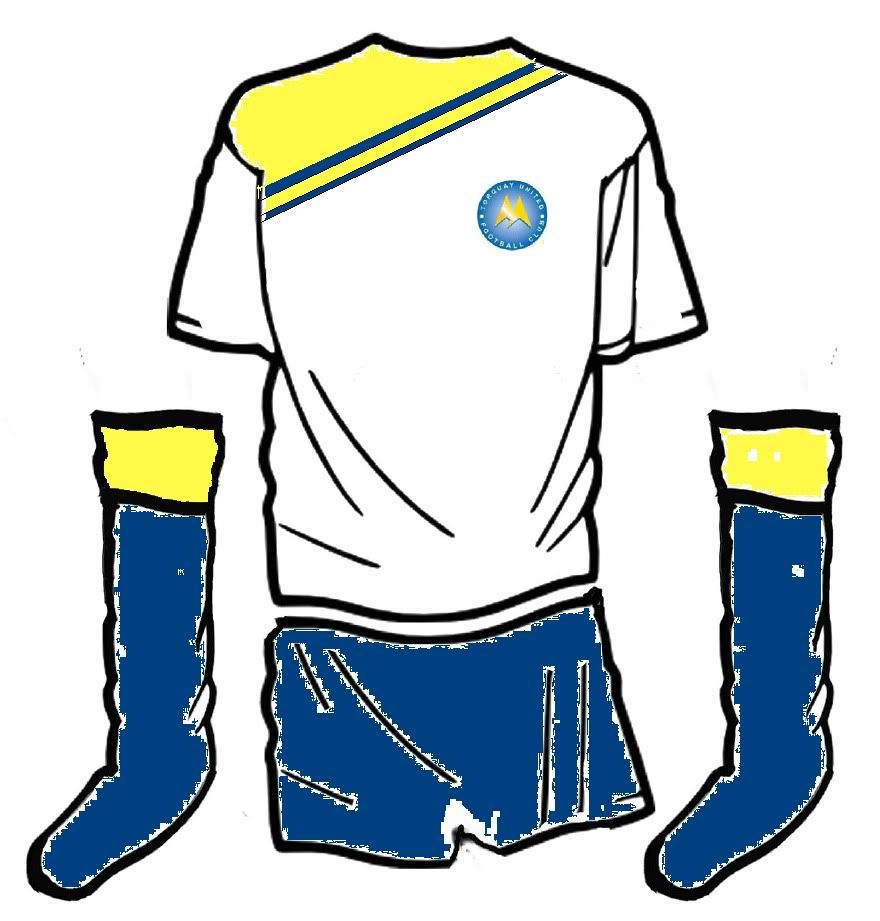
Had a go at the thin stripped version as well. Either way i think white shorts are a must for next season. Looks class with the Yellow and blue
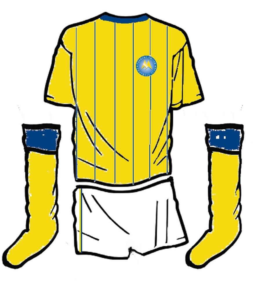
and with a white pin
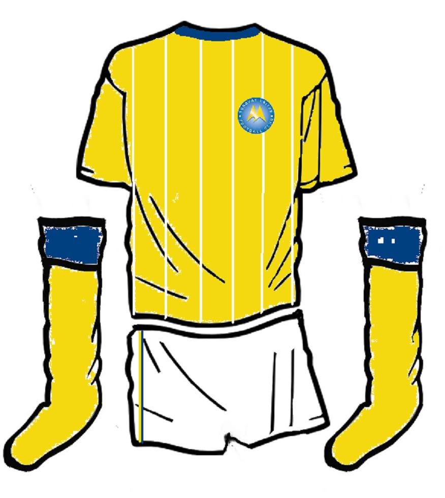
Personally i prefer the white pin. Its different from other teams and will be distingtive to us
Re: Your chance to design next years home kit
Posted: 07 Nov 2010, 09:45
by westbaygull
Like the above striped white number very much....the diagonal striped ones always remind me of 20 Regal king size. Have you submitted these designs to the Club DD?
Re: Your chance to design next years home kit
Posted: 07 Nov 2010, 10:06
by Derrick Dawkins
westbaygull wrote:Like the above striped white number very much....the diagonal striped ones always remind me of 20 Regal king size. Have you submitted these designs to the Club DD?
No not yet, wanted to see peoples thoughts before i sent them off

Re: Your chance to design next years home kit
Posted: 07 Nov 2010, 22:29
by Louis
Love the designs Derrick, submit!
Re: Your chance to design next years home kit
Posted: 07 Nov 2010, 23:12
by Yellow4life
I like the ideas Derrick but to me the first 2 look more like training tops.
I'm not too keen on the pin strips either, good ideas on here though!
Re: Your chance to design next years home kit
Posted: 08 Nov 2010, 10:41
by Derrick Dawkins
Here are some more designs. Let me know what you think.
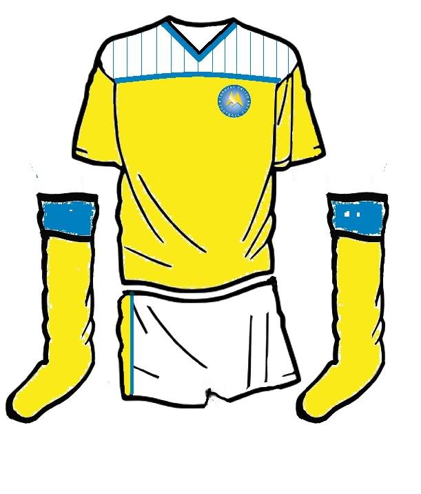
Cheers DD
Re: Your chance to design next years home kit
Posted: 08 Nov 2010, 13:09
by westbaygull
The bottom one - ie 3rd out of your last 3 - is brilliant, DD. Quite like the 2nd of the 3, but not keen on the striped shoulder effect on the first one. If we had the 3rd one, maybe the name/numbers could be in blue?
Re: Your chance to design next years home kit
Posted: 08 Nov 2010, 13:26
by chippygull
Yellow4life wrote:i realise it isnt the best art piece your going to see
but this would be my sort of design-
looks slightly like the man city away kit
yellow backing with blue and darker yellow strips
blue shorts
hooped blue/yellow socks
the kit maker top left with the sponsor in its usual mid shirt

This is still my favourite!!
Re: Your chance to design next years home kit
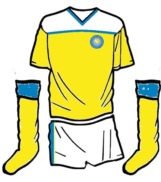
Posted: 08 Nov 2010, 18:52
by YellowM25
For those who asked... the polar negative of my original "gull" design
Cheers
YellowM25
Re: Your chance to design next years home kit
Posted: 08 Nov 2010, 18:55
by YellowM25
And by the way, the two that stand out for me are the first one by tufcgull, and derrick Dawkins first "training top" style one.
I'd guess the first of these may still be basic enough for the traditionalists?
YellowM25
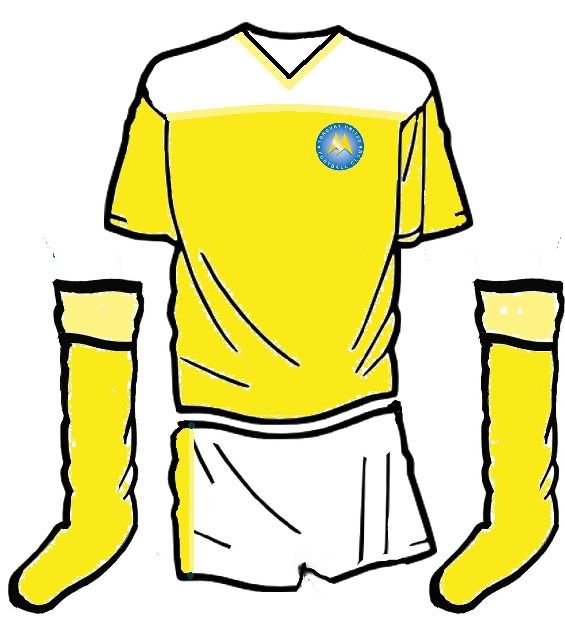
Re: Your chance to design next years home kit
Posted: 09 Nov 2010, 09:08
by Richinns
YellowM25 wrote:For those who asked... the polar negative of my original "gull" design
Cheers
YellowM25
This still works at looks really good. Have you sent this in also YellowM25 because I really think you should!